Motionvillee, USA
Goal
Build a globally resonant brand identity that reflects Motionvillee’s international clientele and elevates perception from a start-up motion studio to a world-class motion design partner.
Solution
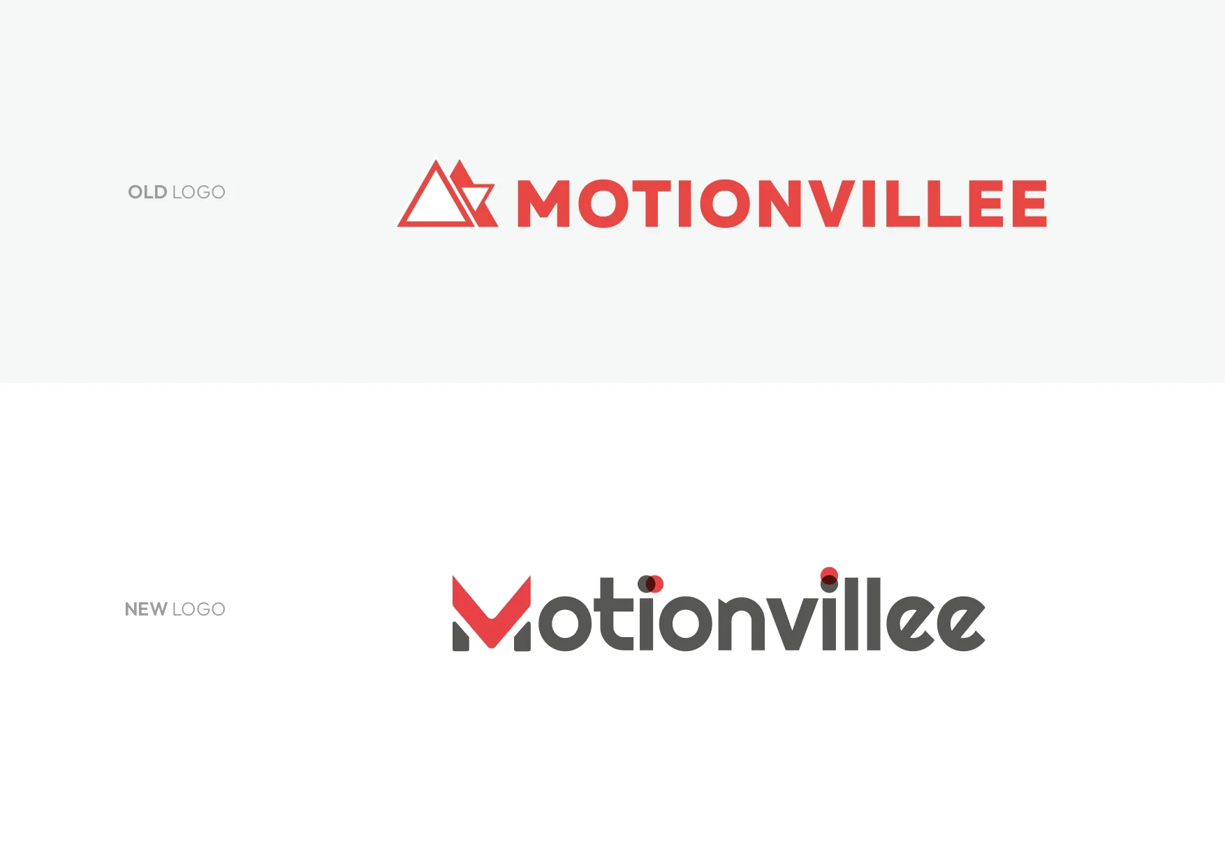
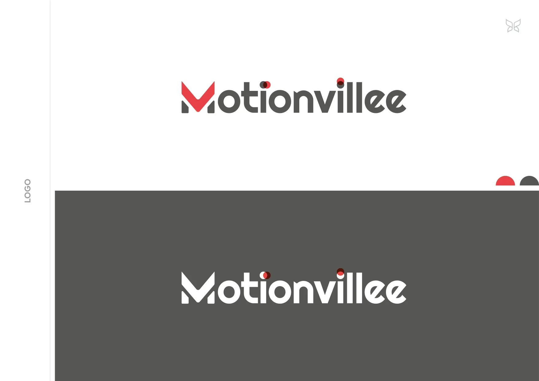
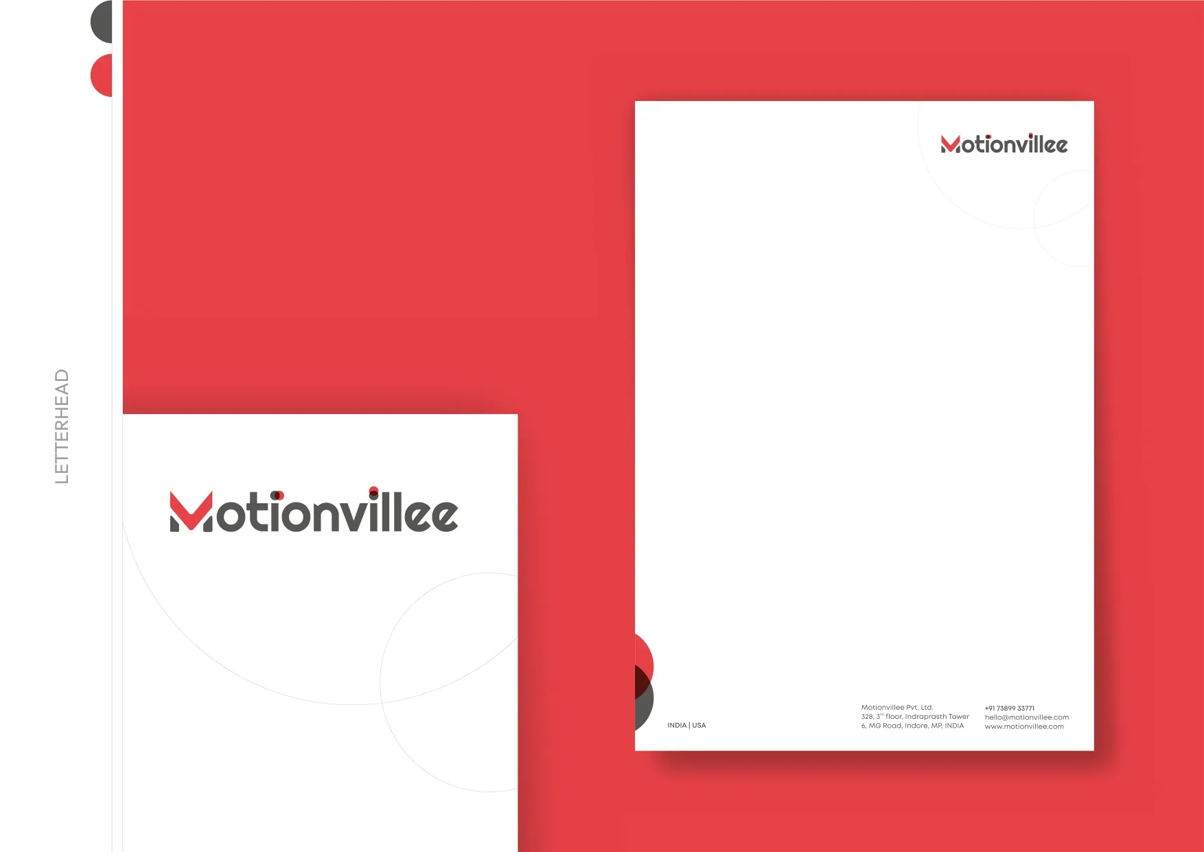
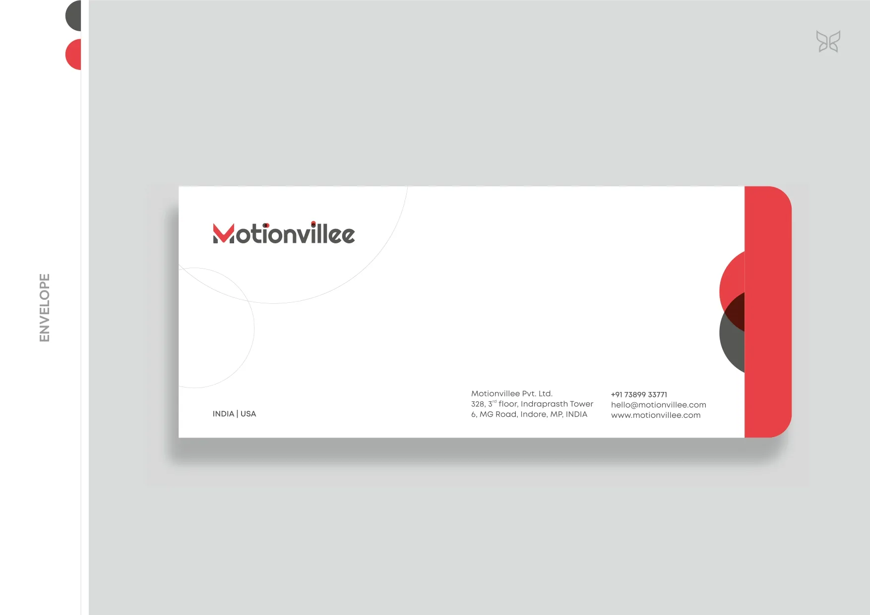
We evolved the early geometric identity into a purposeful global visual system. The double dotted ‘I’ was redesigned as looping motion trails to embody movement in action, while the inverted ‘V’ in ‘M’ was crafted as a subtle play button, embedding the essence of motion within the logotype. This intelligent symbolism became the core brand device, consistently translated across digital and physical touchpoints.
Deliverables
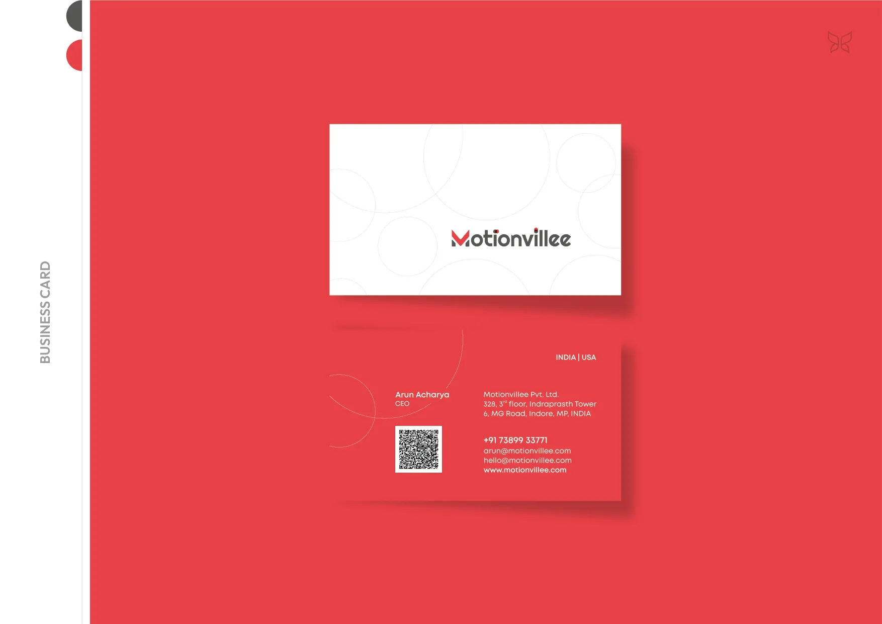
- Logo Design
- Stationery Design
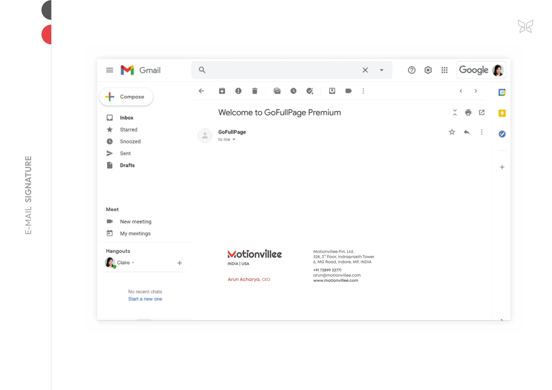
- Email Signatures
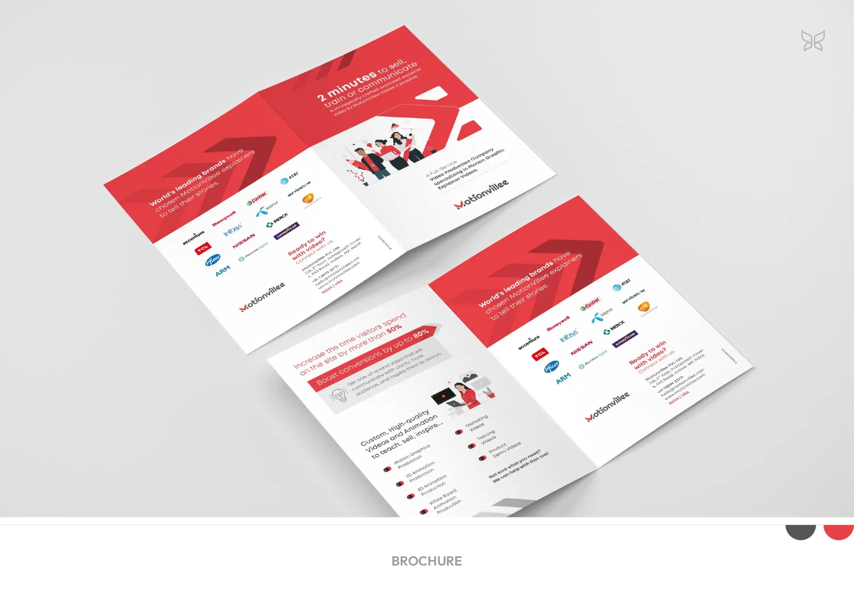
- Company Brochure
- Website UI
- Video Thumbnails
- Brand Adaptations
Result
A refined, globally aligned identity system that visually communicates motion, precision, and scale. The brand now presents itself as premium, internationally credible, and strategically designed rather than aesthetically assembled.