Prem Healthcare
Goal
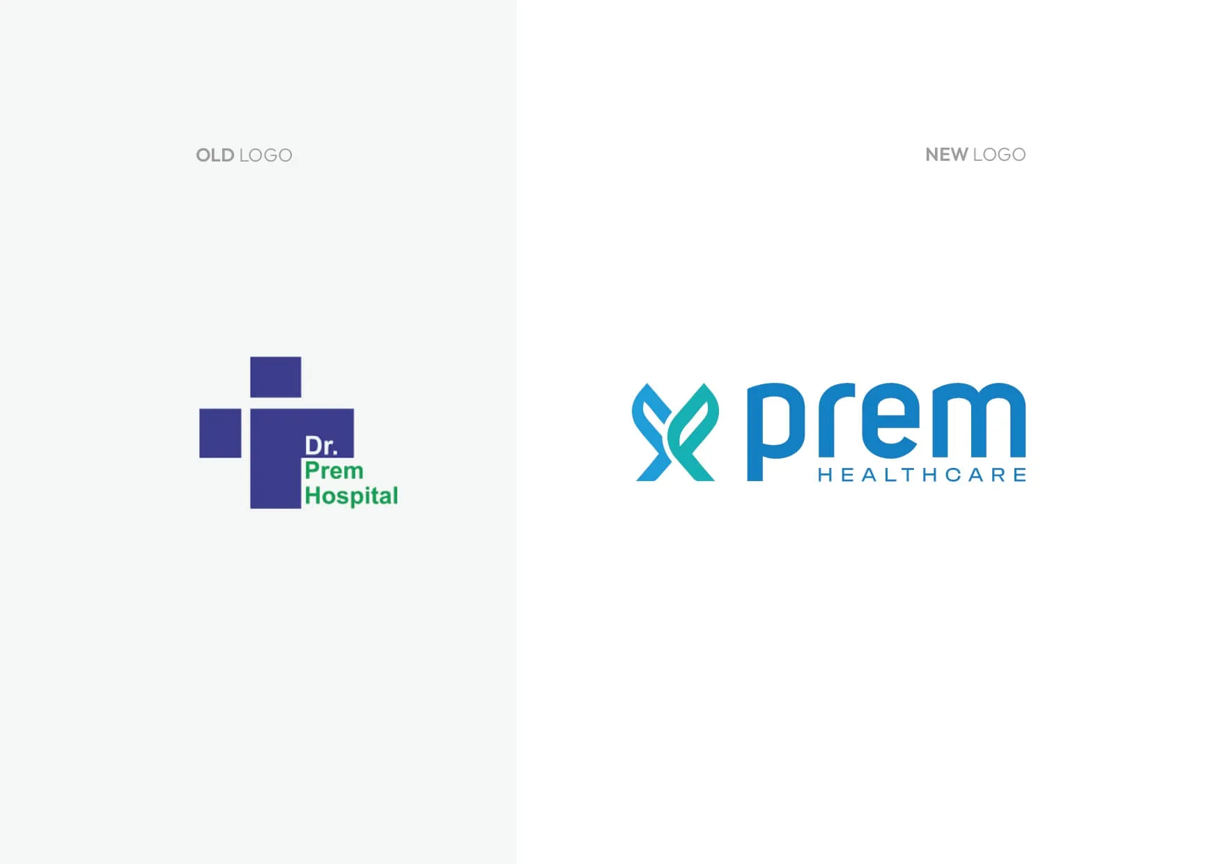
Transform a visually inconsistent, multi-coloured 90s identity and reposition Prem Healthcare as a technologically advanced, infrastructure-led medical institution, without losing the emotional equity built by three generations of doctors over five decades.
Solution
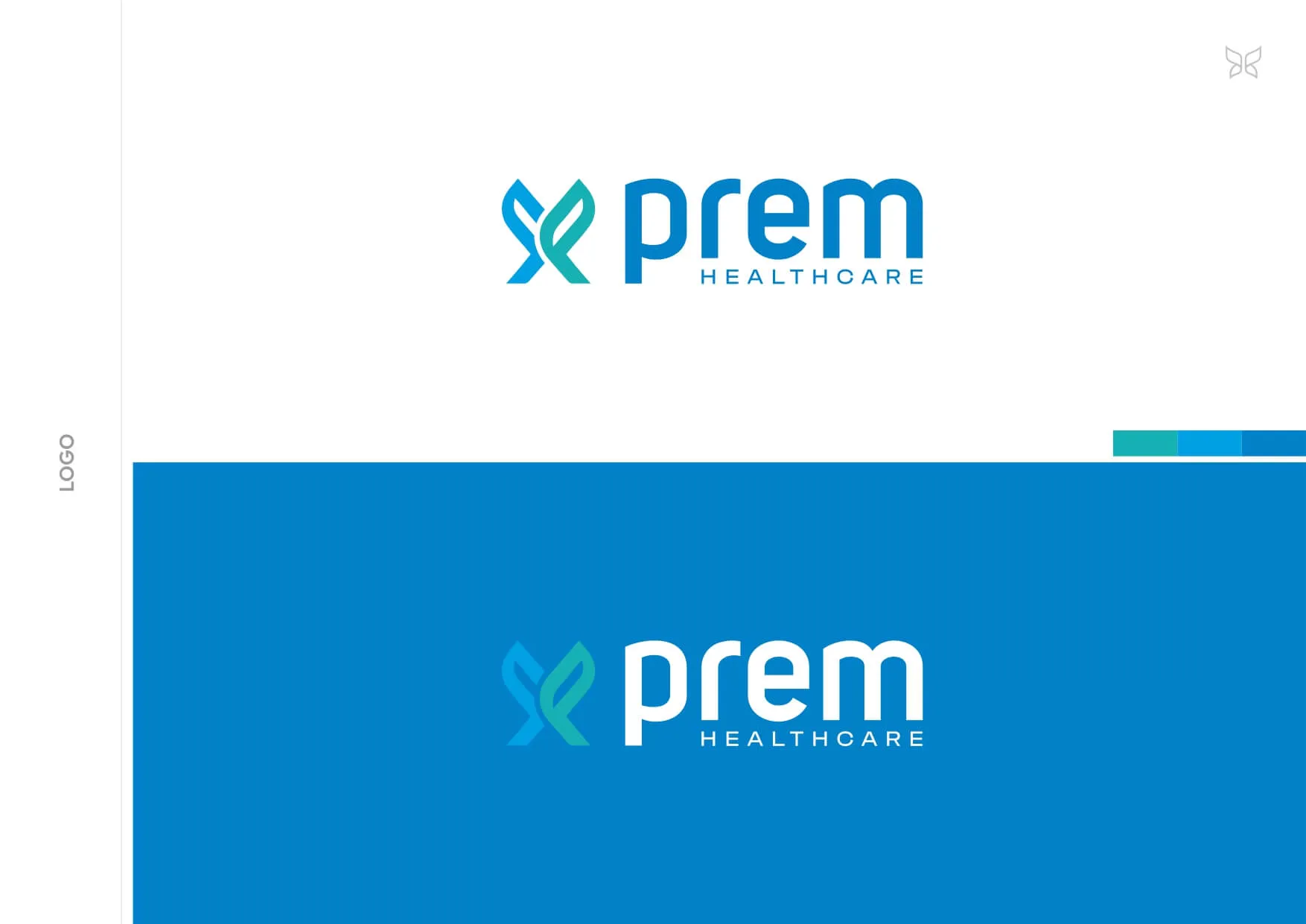
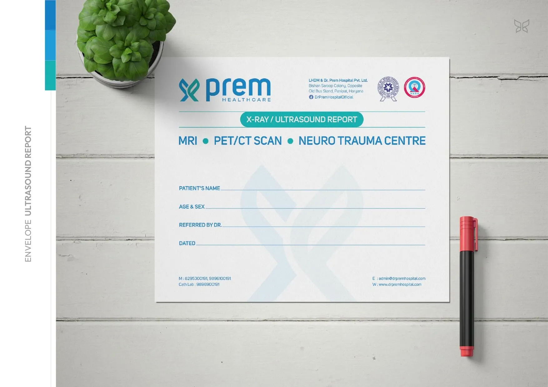
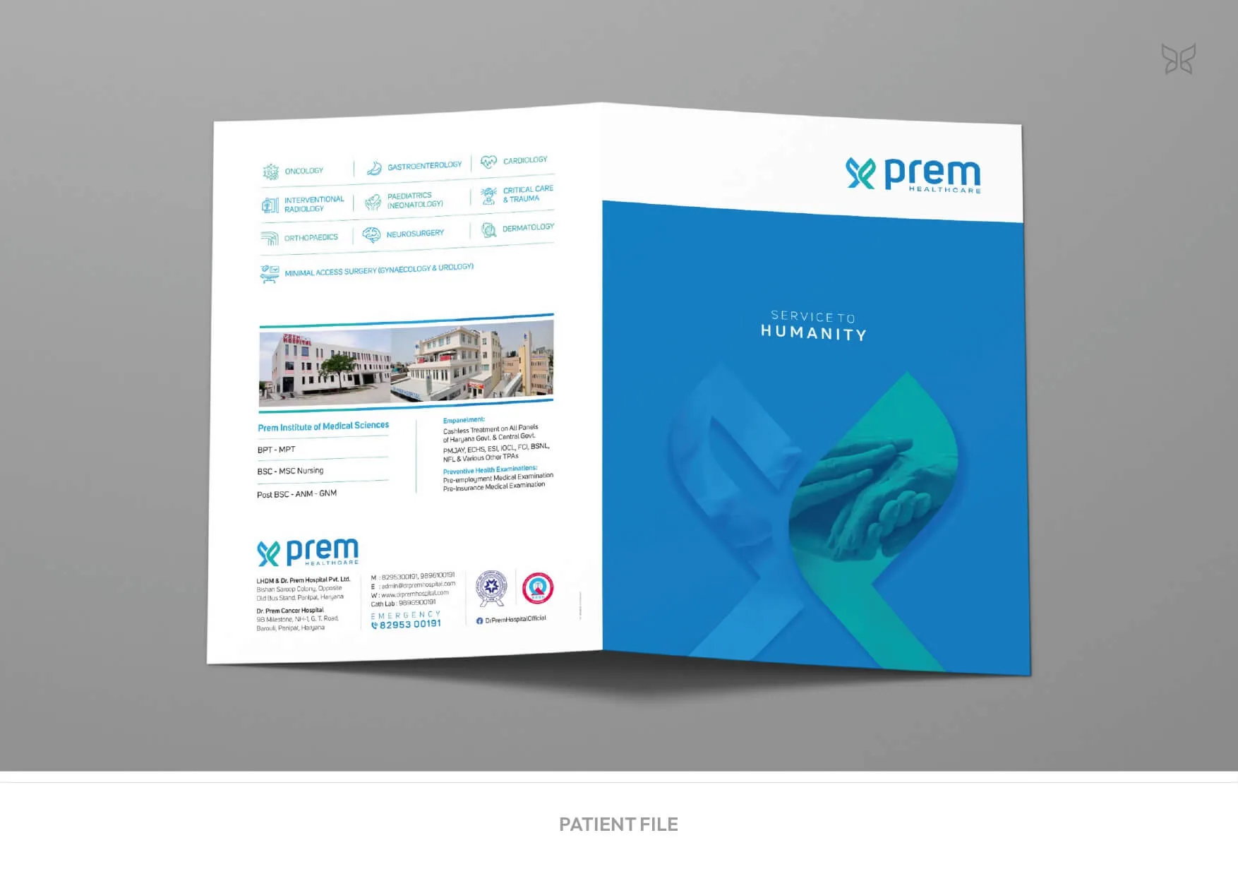
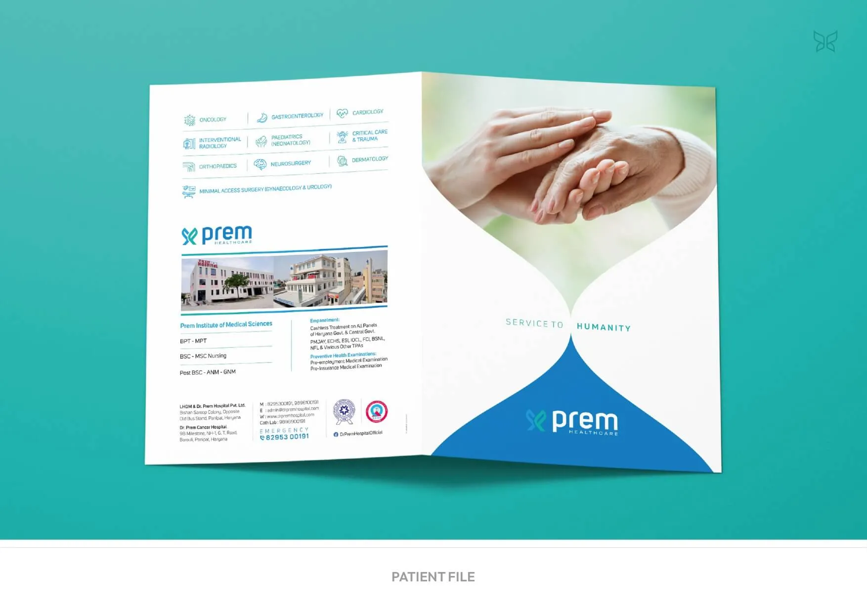
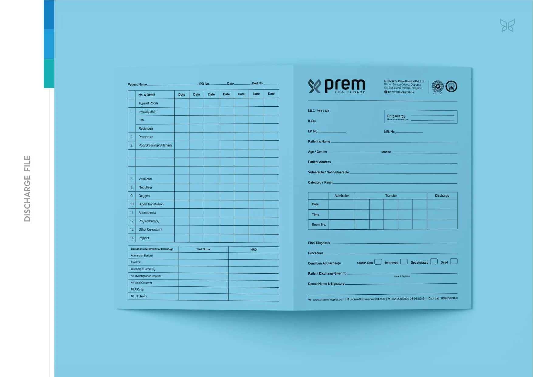
We eliminated fragmented legacy visuals and introduced a disciplined teal–blue palette to signal clinical precision and trust. The new ‘P’ monogram, derived from ‘Prem’, was engineered as a care-centric emblem - structured, balanced, and scalable - and deployed as a master brand device across every physical and communication layer of the hospital ecosystem.
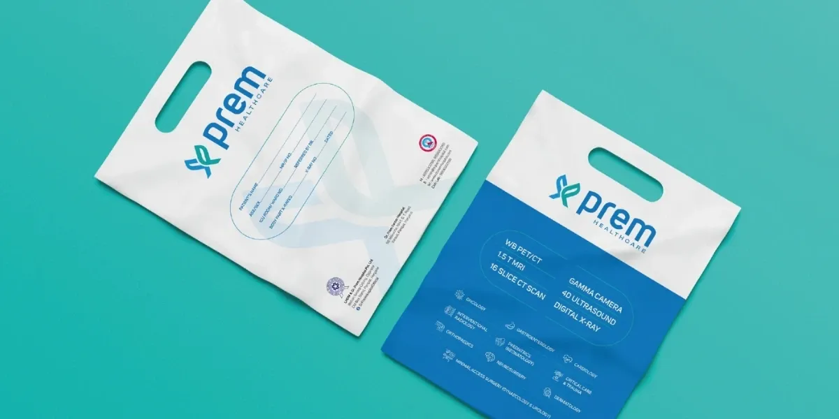
Deliverables
- Logo Redesign
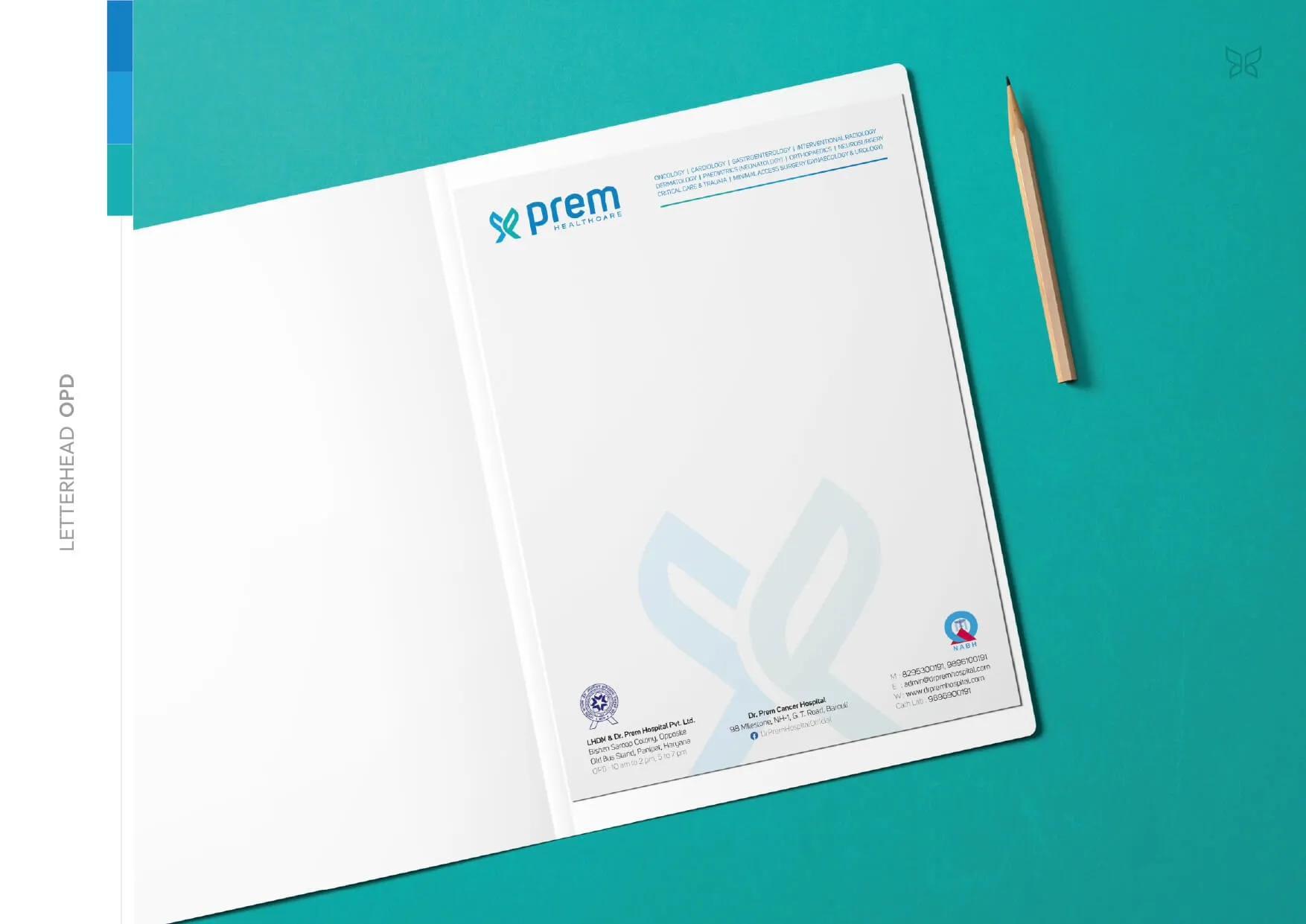
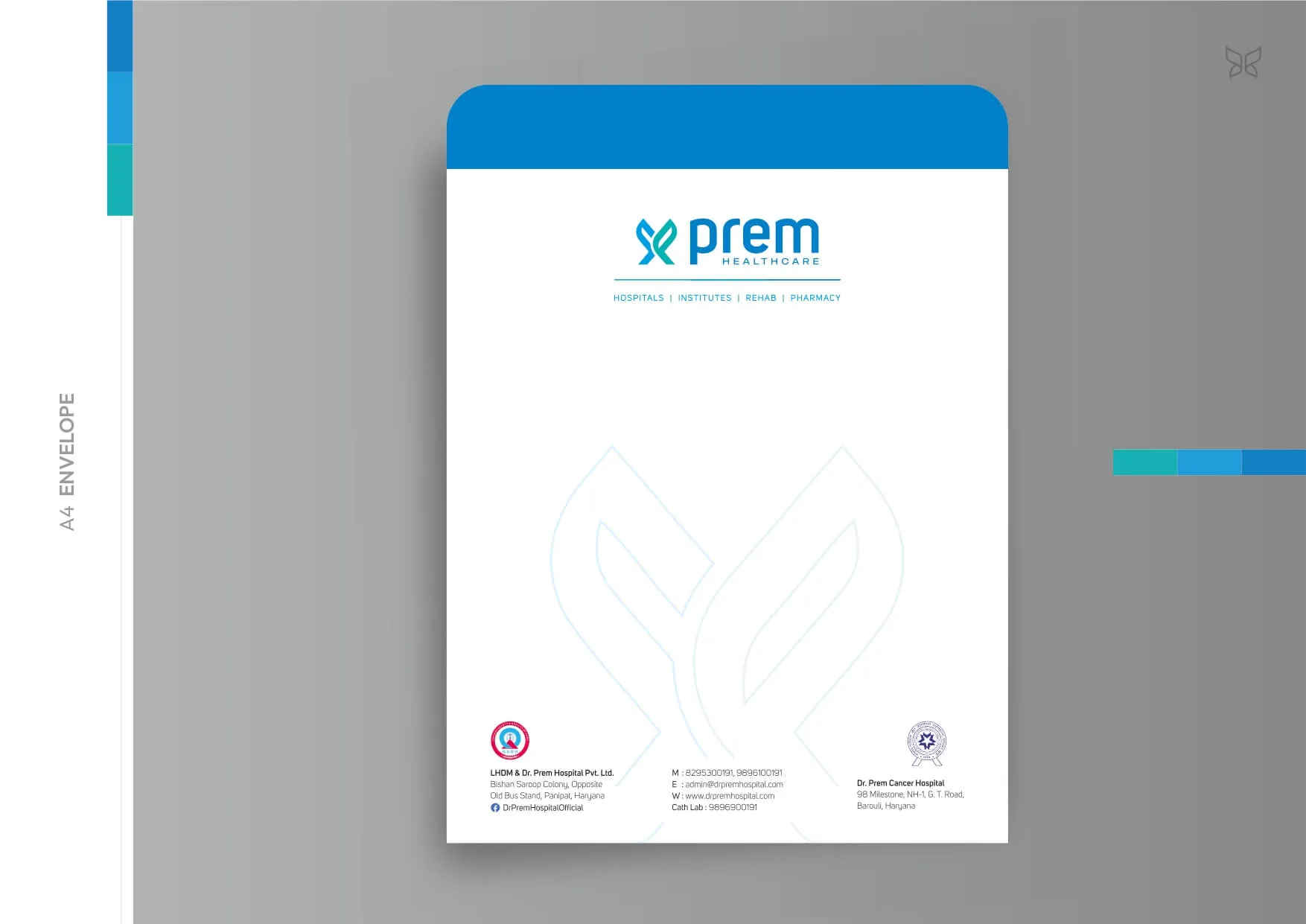
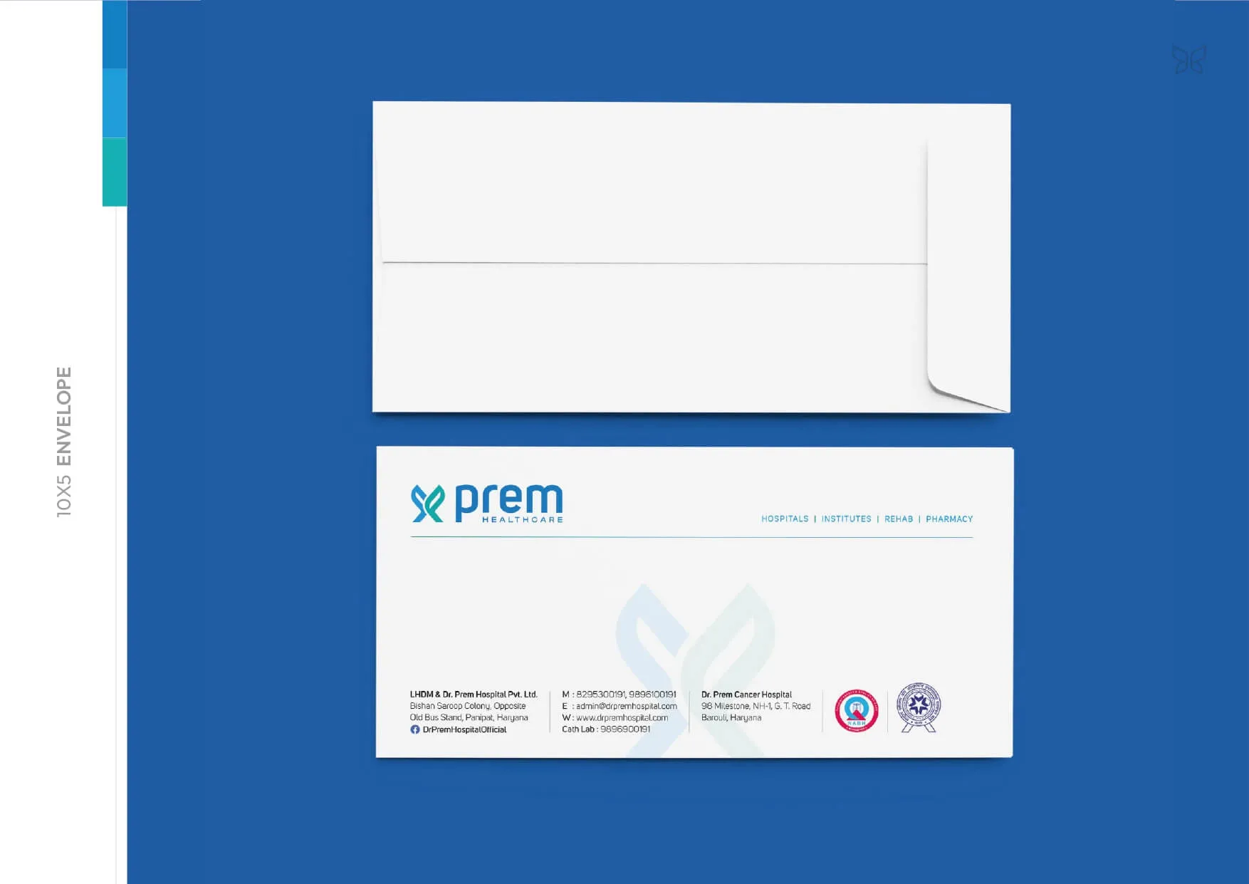
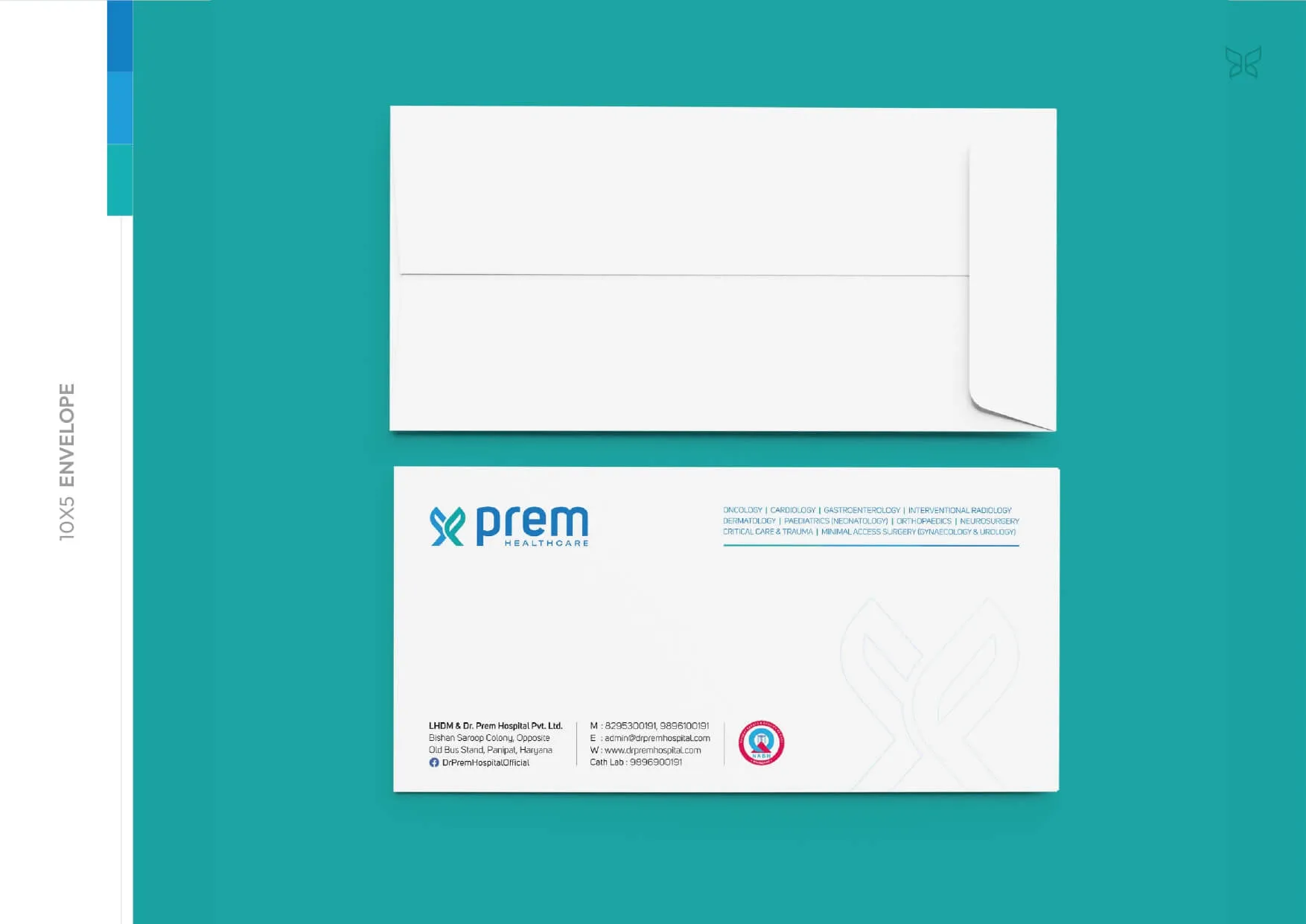
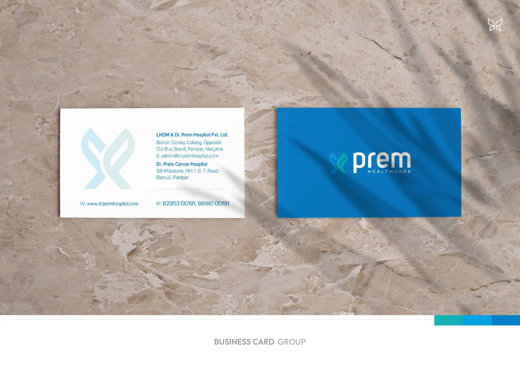
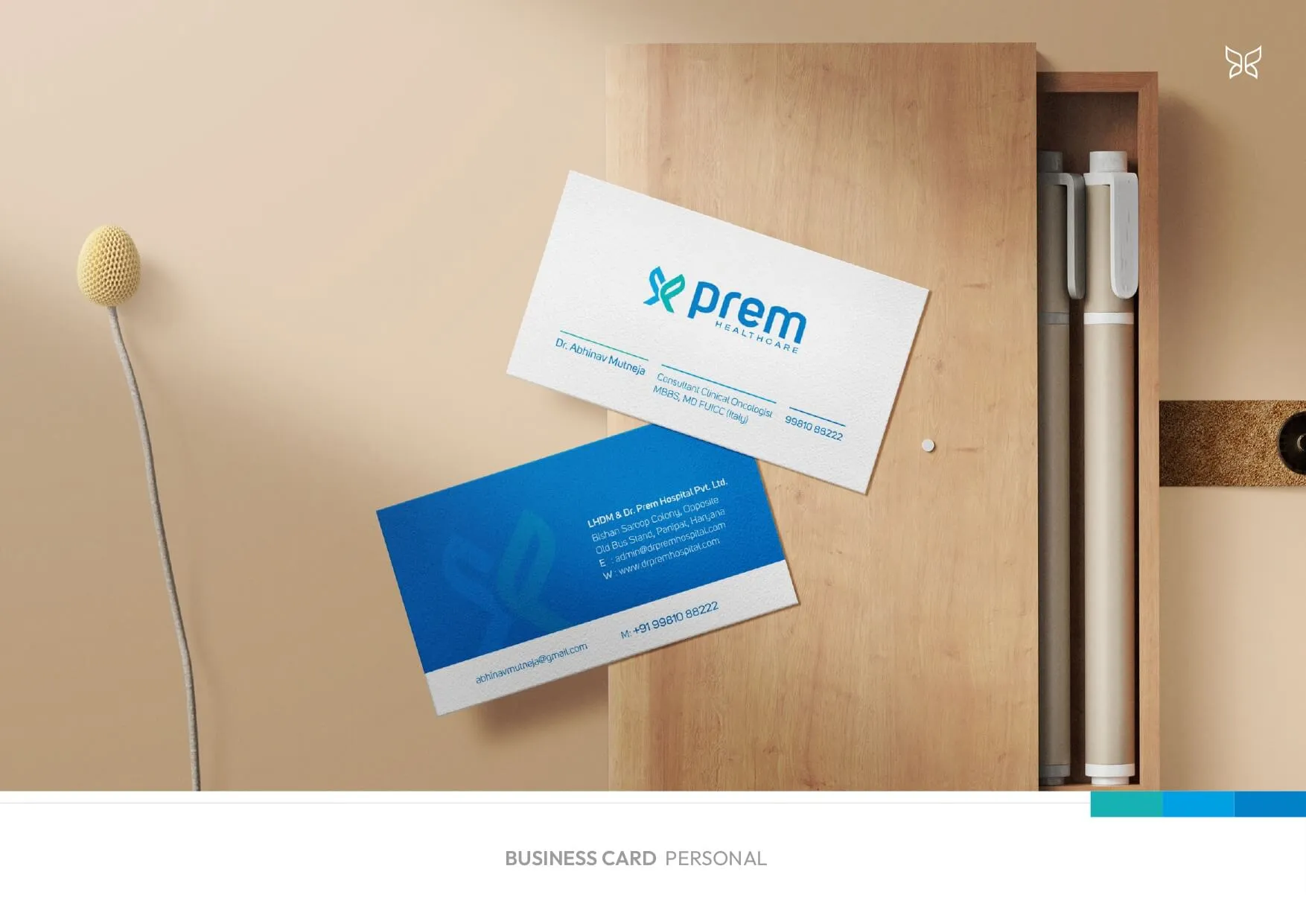
- Stationery Design
- Department-Specific Hospital Deliverables
- Hospital Brochure
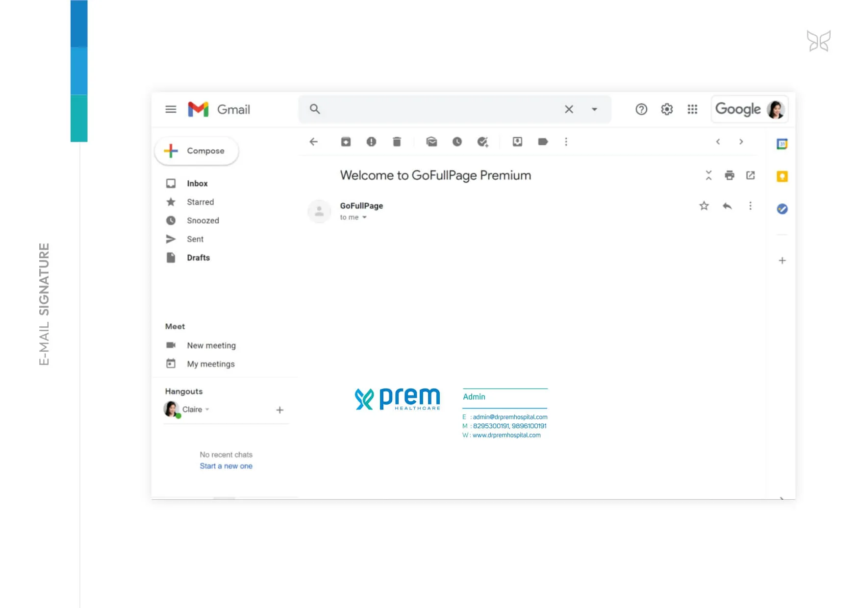
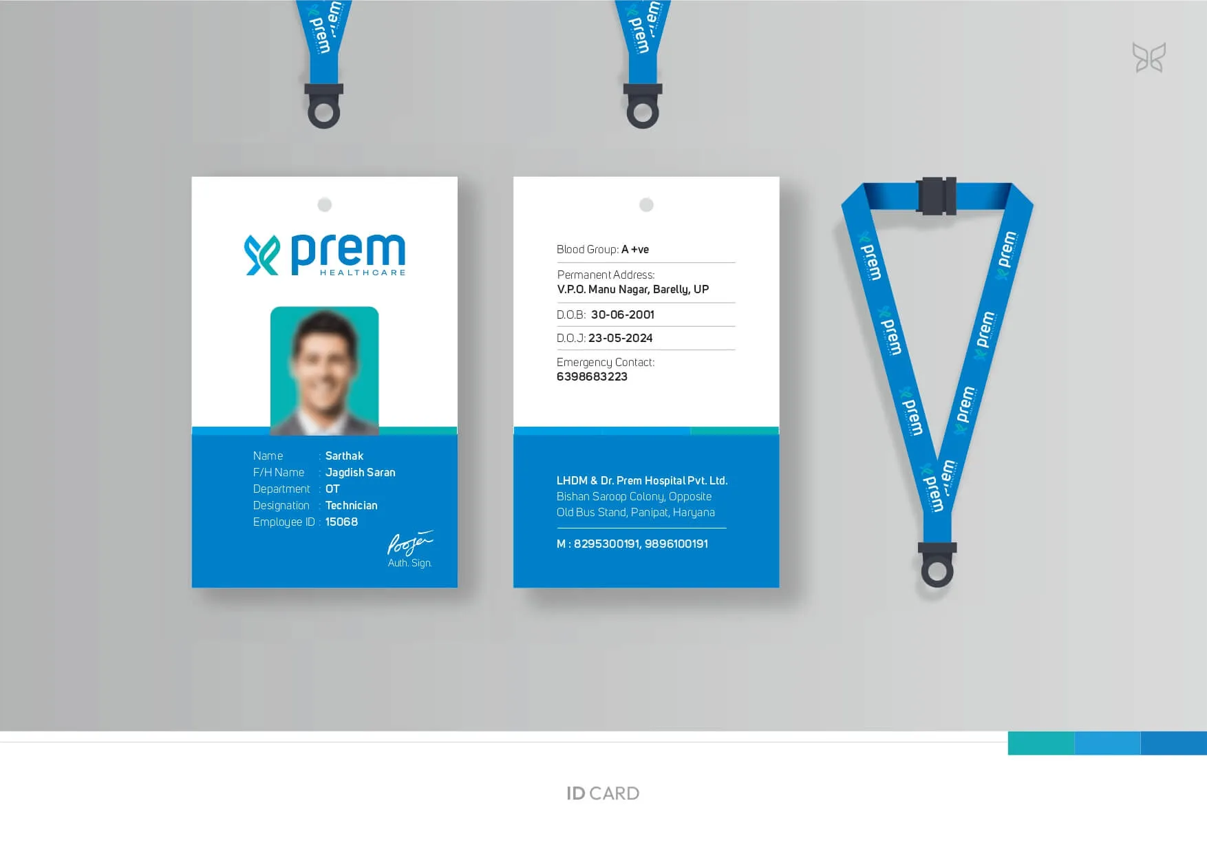
- Signatures & IDs
- Doctor Aprons / Scrubs
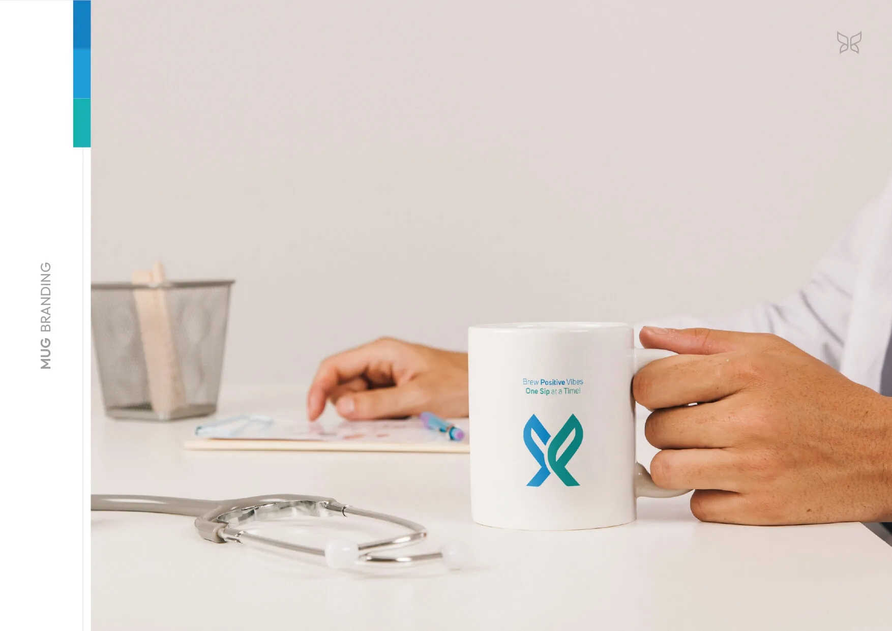
- Administrative Kit
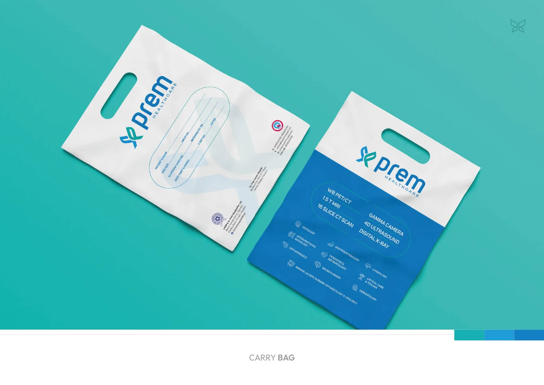
- PRO Kit
Result
A cohesive, future-facing healthcare identity system that visually articulates advanced medical infrastructure with inherited credibility, formally launched as the brand’s 50th Anniversary transformation milestone.